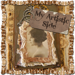
This morning I was looking at my blog to be sure the Cowboy Up! photo came up (I have done a bunch of blogs in advance) and I decided that it was unbalanced.
Way too overloaded on the right side. So I tore off the edging on the left and added a bit of dark blue fabric and put the edging on top of it. I like this better. Do you?? I haven't sewn or glued this down yet. Seems better balanced.
Judy, I am not sure if I am seeing the colors of the blue trims as they really are. I am having a hard time with the lighter blue on the right side only being in one place when there is dark blue in the ticking and at the top and now on the left side. I do think it is balanced more but not sure about the coloring of the blues. When I try to enlarge the before picture to see the blue on the right better, it goes to the vintage workshop so I am not getting a clear view of the blue on the right. What if you try a piece of it under the edging on the left? Or try a piece of the darker blue as the edging on the right. You are looking at the actual piece though and all of your work has been amazing so I say, go with YOUR gut!
The blue on the right looks lighter because it is fringed and there is white in the denim fabric and the light source is different. If you look up at the top right hand corner of the cowboy picture you can see the actual color of the denim -- also just above the belt buckle. They are pretty close. The picture doesn't show that well. Just that the fringe is highlighted from the light source on the left (the window). See the difference in the picture below it taken with a different light source.
I am not bothered by the different blues, actually. But thanks for the input, Cece.
P.S. If you want an enlargement of the whole photo, click anywhere but on the cowboy image and it will enlarge it. There must be some code imbedded in that image(and it surprises me that it comes up in a photo of a photo) that goes to The Vintage Workshop which is where the photo came from.
Been enjoying all the fabric collages. Leaves me drooling to want to try some myself but it'll have to wait, got enough on my plate. I agree, adding blue to the left makes it better balanced but they're beautiful none-the-less. Marissa


8 comments:
Judy,
I am not sure if I am seeing the colors of the blue trims as they really are. I am having a hard time with the lighter blue on the right side only being in one place when there is dark blue in the ticking and at the top and now on the left side. I do think it is balanced more but not sure about the coloring of the blues. When I try to enlarge the before picture to see the blue on the right better, it goes to the vintage workshop so I am not getting a clear view of the blue on the right. What if you try a piece of it under the edging on the left? Or try a piece of the darker blue as the edging on the right. You are looking at the actual piece though and all of your work has been amazing so I say, go with YOUR gut!
The blue on the right looks lighter because it is fringed and there is white in the denim fabric and the light source is different. If you look up at the top right hand corner of the cowboy picture you can see the actual color of the denim -- also just above the belt buckle. They are pretty close. The picture doesn't show that well. Just that the fringe is highlighted from the light source on the left (the window). See the difference in the picture below it taken with a different light source.
I am not bothered by the different blues, actually. But thanks for the input, Cece.
P.S. If you want an enlargement of the whole photo, click anywhere but on the cowboy image and it will enlarge it. There must be some code imbedded in that image(and it surprises me that it comes up in a photo of a photo) that goes to The Vintage Workshop which is where the photo came from.
I liked it before, but now that you mention it and have changed it, it does look more balanced. Love it!
Susan
I didn't see what you saw in your original piece, but with the before and after photos (so to speak), I agree it is better balanced now.
Again, I am here... lurk, staring at all the loveliness you've created!
Yep, I have to say that I agree with you now that I see it. But I loved the first one too! K
I got to see the enlarged picture by following your directions. It looks great, Judy. Thanks for helping me enlarge it!
Been enjoying all the fabric collages. Leaves me drooling to want to try some myself but it'll have to wait, got enough on my plate.
I agree, adding blue to the left makes it better balanced but they're beautiful none-the-less.
Marissa
Post a Comment